Print That Pops
Designs made for print—clean, bold, and memorable, every design makes an impact.
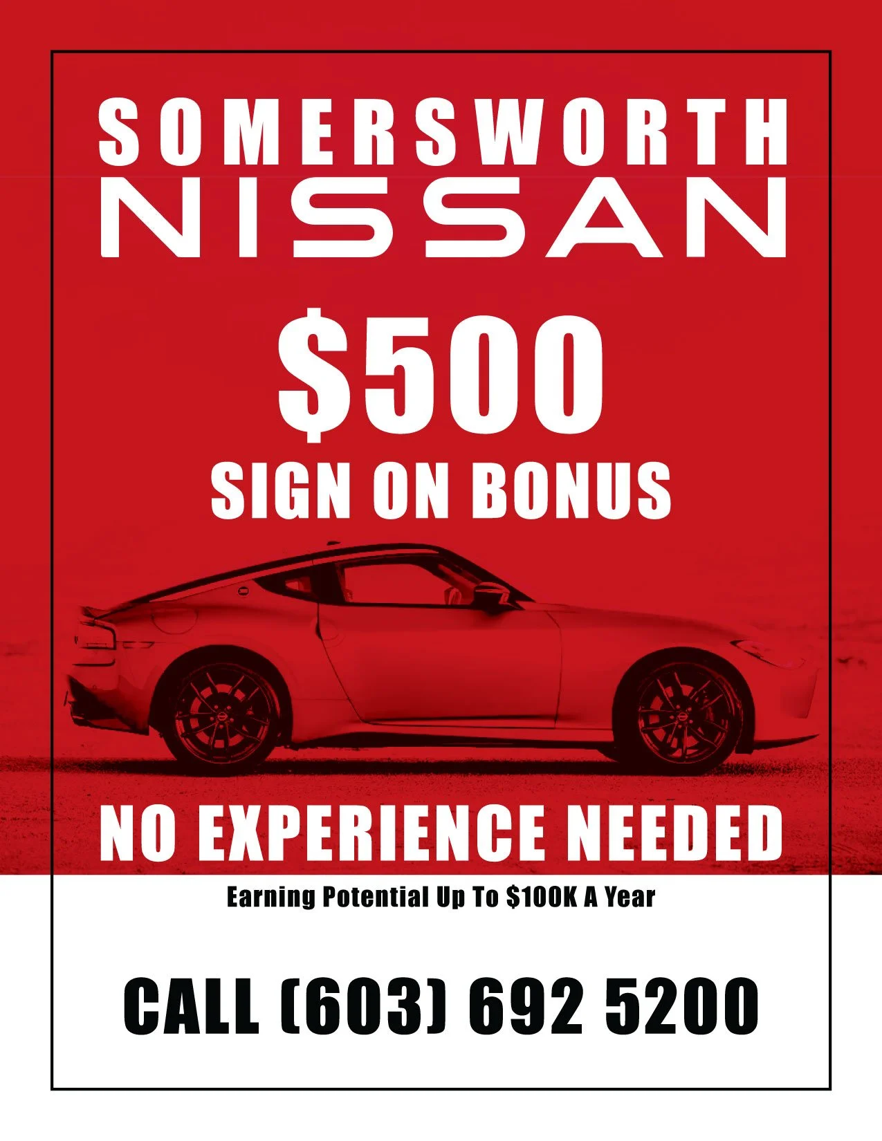
Bold & Indirect Yet Understandable
Designing a flier for new hires following Nissan brand guidelines provided me with a fun and simple project. Knowing that physical mediums need to be easily read, understood and short enough that you get your point across quickly. I didn’t even need to mention we were hiring but rather imply it with incentives that jump out to a viewer and a call to action that was quick and simple.
Although not complex to design it was a great exercise in typography and hierarchy. Bold colors to catch attention and compliment to Nissan’s brand. Effective in producing candidates to fill sales roles at Somersworth Nissan.
From Screen to Storefront
At Yesway, I created a range of in-store signage designed to grab attention and guide the customer experience. From bold cooler banners and promotional mailers to durable store mats, each piece was built to be both eye-catching and practical. The goal was to highlight key promotions in a way that felt clear, consistent, and on-brand while standing out in a busy retail setting.
All signage was produced in CMYK to ensure accurate print colors, helping the designs look just as strong in-store as they did on screen. By focusing on clean layouts, hierarchy, and brand alignment, I delivered signage that not only looked sharp but also supported real results at the point of purchase.